Each country bases its official statistics on its own definition of “urban.” While this practice may work well for each nation’s internal purposes, it poses problems with comparisons among places. Comparing urban population levels and such related topics as urban poverty, urban carbon emissions, or urban infrastructure across countries using these definitions can be misleading, as the same settlement might be considered “urban” in one country and not in another. The United Nations Statistics Division’s 2018 Demographic Yearbook explains in notes on Table 6, which begin on page 120, that in the United States a place is urban if it is an agglomeration of 2,500 or more inhabitants, generally having population densities of 1,000 persons per square mile or more; in Senegal, it takes an agglomeration of 10,000 to be urban. To derive the well-known figure that more than half the world’s population live in urban areas, the UN simply adds up individual data from each country and publishes the results in a report, World Urbanization Prospects, issued biannually.
The increasing availability of satellite imagery is now allowing researchers to use standardized approaches to define, measure, and compare urban areas globally. For example, scientists have developed approaches based on night-time lights—the artificial light sources visible in satellite images taken at night—to map and measure human settlements. They have also used them to track changes in economic activity, including the effects of the COVID-19 pandemic.
In his article in the October 2020 issue of Urban Link, Lewis Dijkstra discusses a different approach, developed by the European Commission, World Bank, OECD, UN Habitat and the FAO and endorsed by the United Nations Statistical Commission in March 2020. Called the Degree of Urbanisation, this method combines census data with a map of built-up areas derived from satellite imagery to produce a population distribution map for the globe. Criteria based on population size and density are then applied to delineate cities, towns, suburbs, and rural areas on the map.
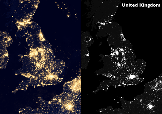
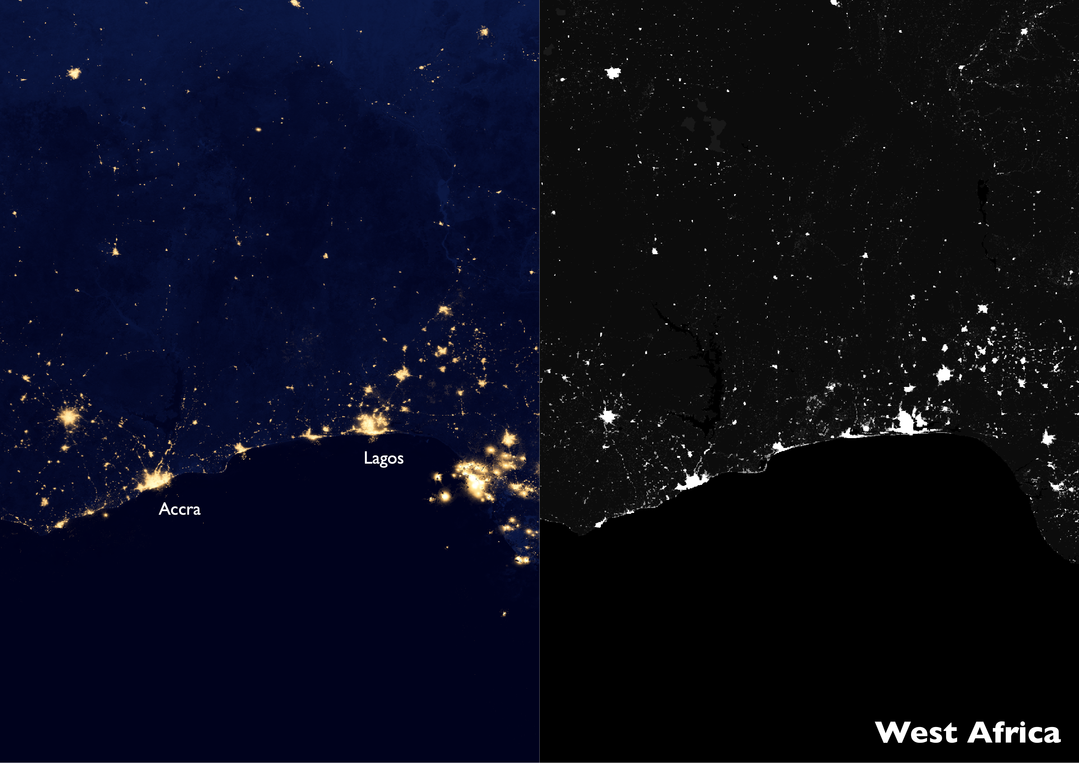
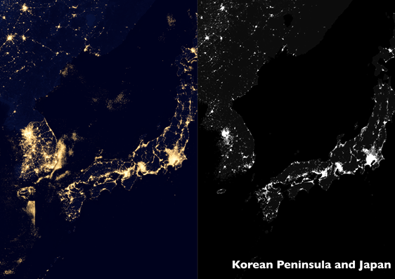
As satellite data become available more readily and frequently, international organizations, researchers, and nations are likely to adopt standardized, globally comparable approaches as exemplified by this one. Penn IUR’s Andrew Renninger has created paired images of urbanization using data from nightlights generated by the U.S. National Aeronautics and Space Administration (NASA) and the European Commission’s Joint Research Center to display what some urban areas look like using both approaches; see maps of the United Kingdom, West Africa, and the Korean Peninsula and Japan, below.


